
Creating Your First Slider
Once Boo Slider has been installed into your site, you'll see Boo Slider element on THIRD PARTY section.
After you Drag & Drop it into the content area, a blank slide will automatically be created for you, and you will see the following:
After you Drag & Drop it into the content area, a blank slide will automatically be created for you, and you will see the following:

The first thing you will need to make changes to the setting is the Slider size. There are 3 options: Normal, Fit, Fullwidth.
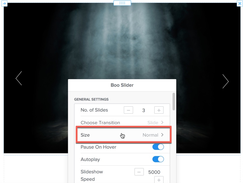
- Normal: The slider will always inherit the width of its column container (similar to Slideshow element)., allowing it to fit seamlessly inside your theme’s page layout.
- Fit: The width of your slider is determined by the width of body container.
- Fullwidth: Slider will always stretch across the entire width of the screen.
Creating Your First Slide
We will create an example slide with a background image and a single text element.
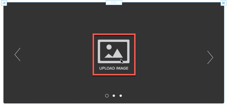
Upload your image for the first slide.
Hover over the UPLOAD IMAGE icon, then click on that icon to upload your image.
Hover over the UPLOAD IMAGE icon, then click on that icon to upload your image.
Adding a Text Element (You can add any elements, this is just an example).
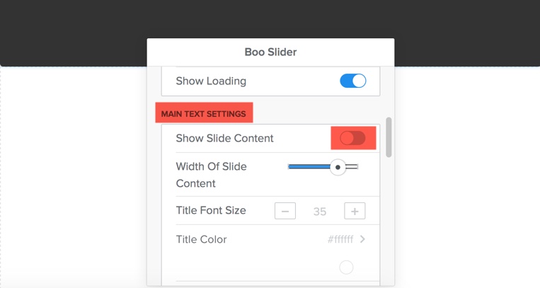
First, you'll need to enable Show Slide Content option in the SETTINGS pop-up.
Click on the slider, then within the SETTINGS pop-up, scroll to MAIN TEXT SETTINGS, Toggle on Show Slide Content option.
First, you'll need to enable Show Slide Content option in the SETTINGS pop-up.
Click on the slider, then within the SETTINGS pop-up, scroll to MAIN TEXT SETTINGS, Toggle on Show Slide Content option.
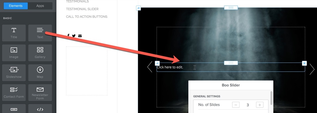
You'll see a rectangular box with dots. Drag & Drop Text element into that area.
Create next slides
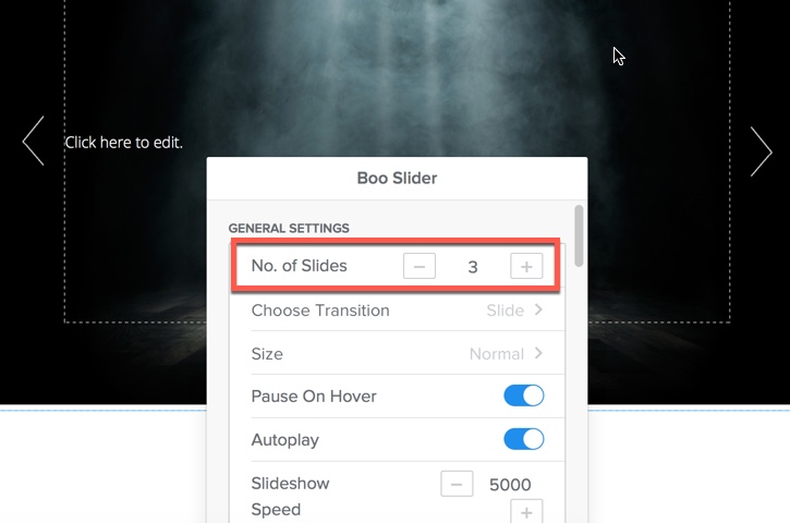
Click on the slide to open the SETTINGS pop-up, edit the number of slides for your Slider using "No. of Slides" option.
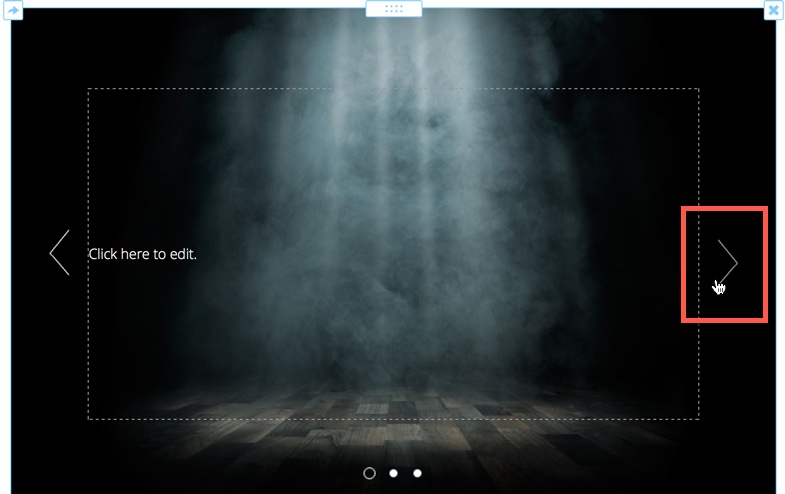
To edit next slides, click on the arrow icon to move on next slides.
Adding images or elements into slides using the same method above.
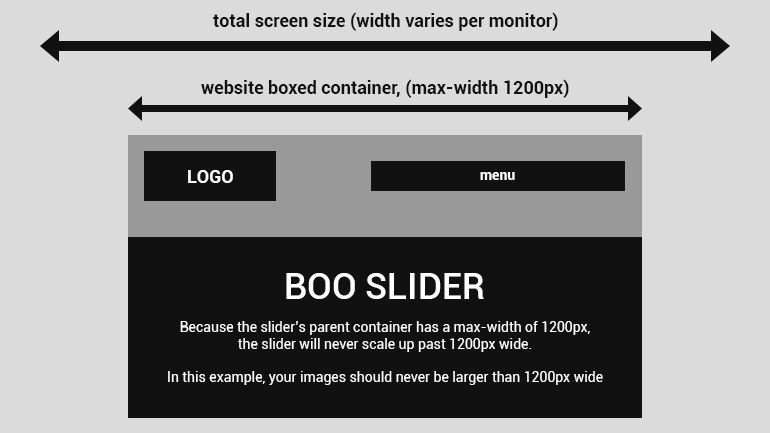
Ideal Image Size
1. Very large images = large file size = long loading time. Keep your images “web friendly”.
2. Don’t use images larger than they need to be.
GENERAL SETTINGS
These settings are global and apply to the entire slider.
No. of Slides: Change the number of slides for the slider.
Choose Transition: Fade or Slider
Size:
Pause On Hover: Stop slider progress when the user hovers their mouse over the slider.
Autoplay: Toggle on to make the slider autoplay.
Slideshow Speed: in milliseconds (1000 = 1 second)
Animation Speed: The transition duration for the content’s movement. Use a lower number such as “750” for fast movement, and a higher number such as “2000” for smoother motion.
Show Loading
Choose Transition: Fade or Slider
Size:
- Normal: The slider will always inherit the width of its column container (similar to Slideshow element)., allowing it to fit seamlessly inside your theme’s page layout.
- Fit: The width of your slider is determined by the width of body container.
- Fullwidth: Slider will always stretch across the entire width of the screen.
Pause On Hover: Stop slider progress when the user hovers their mouse over the slider.
Autoplay: Toggle on to make the slider autoplay.
Slideshow Speed: in milliseconds (1000 = 1 second)
Animation Speed: The transition duration for the content’s movement. Use a lower number such as “750” for fast movement, and a higher number such as “2000” for smoother motion.
Show Loading
MAIN TEXT SETTINGS
Show Slide Content: Toggle on so you can drag & drop content into each slide.
Width Of Slide Content: Adjust the width of the drag & drop content area on each slide.
Title Font Size: Change the size of Title element on the content area of each slide.
Title Color: Change color of Title element on the content area of each slide.
Paragraph Font Size: Change size of Text element on the content area of each slide.
Paragraph Color: Change color of Text element on the content area of each slide.
BG Overlay: Add an opacity layer over the background of each slide.
BG Overlay Color: Change color of the opacity layer
BG Overlay Opacity: Adjust opacity level.
Text Overlay: Add an opacity layer over the Title/Text element.
Text Overlay Color: Change color of the opacity layer
Text Overlay Opacity: Adjust opacity level.
CONTROL SETTINGS
Show Arrows: Choose whether or not you would like to display left and right navigation arrows.
Arrow Style: Choose between 12 different pre-built styles
Arrow Size: Small; Medium; Large
Arrow Style: Choose between 12 different pre-built styles
Arrow Size: Small; Medium; Large
BULLET SETTINGS
Show Bullets: Choose whether or not you would like to display the circle buttons/slide indicators at the bottom of the slider.
Bullet Style: Choose between 9 different pre-built styles
Gap: Adjust spacing between bullets.
Bullet Style: Choose between 9 different pre-built styles
Gap: Adjust spacing between bullets.
SPACING
Top Margin: Add some space above the slider in relation to other content on the page.
Bottom Margin: Add some space below the slider in relation to other content on the page.
Bottom Margin: Add some space below the slider in relation to other content on the page.